
World Maps Might Soon Get an Upgrade. The United Nations Votes to Endorse Global Charts That Better Represent Africa's True Size
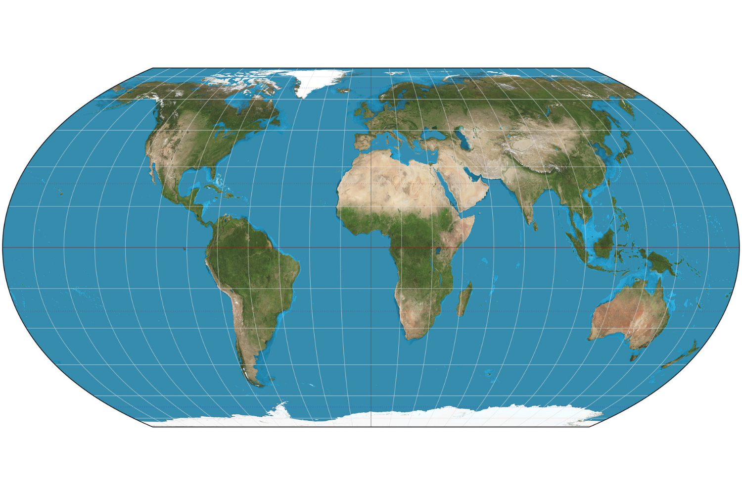
The United Nations has backed a shift in the way the world is pictured, endorsing map designs intended to show countries and continents in proportions closer to their real surface areas. The move places fresh attention on a familiar image that has shaped classrooms, atlases and public imagination for generations: a world map in which Africa can appear far smaller than its actual scale. The recommendation favors maps that preserve relative area rather than the traditional chart most people recognize.
At the center of the discussion is the Mercator projection, a map design created in 1569 by Gerardus Mercator, a cartographer from Flanders. It became a landmark tool for seafaring because of its navigational usefulness. Yet a projection devised for that purpose has also become a default visual language for representing the entire planet, even though its strengths for navigation do not make it a neutral picture of land-area comparisons.
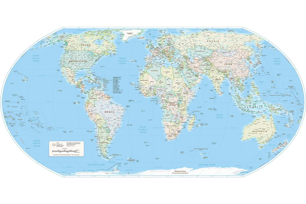
The difficulty is rooted in geometry. Earth is a sphere, while a printed page or digital screen is flat. No uninterrupted flat world map can transfer the planet’s surface without sacrificing something: area, shape, distances or directions must be altered somewhere. Every projection therefore makes a trade-off. Mercator’s trade-off is especially visible at high latitudes, where territories close to the poles expand dramatically on the map while regions around the equator are compressed.
That distortion matters because maps do more than guide travel. They can influence how viewers judge a country’s geographic presence, the distribution of people and resources, and the scale of environmental or political challenges. When equatorial landmasses are visually reduced, comparisons made at a glance can become misleading. Africa, positioned largely near the equator, is among the places most affected by this visual imbalance.
The U.N. recommendation points instead toward equal-area projections, which are designed so that the amount of space occupied by each landmass corresponds more faithfully to its actual share of Earth’s surface. One model singled out is the Equal Earth projection, introduced in 2018. Its purpose is not to eliminate all distortion—no flat map can do that—but to prioritize a more accurate comparison of the sizes of countries and continents.
Geographers Jack Swab and Derek Alderman of the University of Tennessee Knoxville have argued that an area-preserving view can offer a more balanced framework for understanding global patterns. They link that benefit to subjects including population, environmental conditions, development and politics. A map that changes the apparent scale of regions can subtly affect how such patterns are interpreted; an equal-area alternative seeks to reduce that particular source of visual bias.
The latest debate also belongs to a much longer human effort to depict the world. The oldest known world map is the Babylonian Map of the World, also known by the Latin name Imago Mundi. It survives as an inscribed clay tablet from the sixth century B.C.E. and is held by the British Museum in London. Its existence underscores that world maps have always reflected both geographic knowledge and the practical or cultural needs of their makers.
The U.N. endorsement does not mean that familiar Mercator maps will immediately disappear from books, websites or wall displays. Navigation remains a distinct use case, and different projections serve different purposes. The more immediate question is whether schools, institutions, publishers and mapmakers will adopt equal-area maps when teaching or presenting global comparisons. The decision has made that choice more visible, particularly wherever Africa’s size is central to the story being told.
Source: Smithsonian Magazine
Related articles
Immerse Yourself in the Cosmos at Frank Lloyd Wright's Only Planetarium, Recently Restored to Its Former Glory in Florida
Completed in 1958, the domed building is located on the campus of Florida Southern College, home to 13 Wright-designed buildings, the world's largest single-site collection of the architect's work

Play Tractor online with friends — free
Real-time Sheng Ji / Tractor for 3–5 players, with complete bidding and trump rules across web, iOS and Android.
Play bidfive →
A Team of Astronomers Thinks They Have Identified the Exact Night Sky That Inspired Vincent van Gogh's 'Starry Night.' Not Everyone Is Convinced
Very few night skies seen from the south of France during the summer of 1889 would match the scene on van Gogh's canvas. A new study argues that it could have been July 22

'Pretty Boy' Floyd, One of the Most Notorious Outlaws of the Great Depression, Was Shot and Killed in an FBI Raid 92 Years Ago
Some Americans lauded the 30-year-old bank robber as a Robin Hood-esque folk hero. Others castigated him as a violent criminal whose misdeeds were emblematic of the troubled era

GTA 6 guides, updates and practical reference
Explore a Chinese GTA 6 guide library covering the release, map, characters, missions, vehicles and weapons.
Browse guides →
Create AI images with your own API key
aixipi runs on desktop/web, uses your own model API balance, and avoids subscription lock-in.
Try aixipi →